Learning Objectives
By the end of this lesson, you will be able to:
- Describe techniques for creating accessible OER
Introduction
Content should be created in a way that makes it accessible to all learners. As you plan an OER adoption or adaptation, plan to check the accessibility of your content before making it available to others. Not only is this a generally good practice, content published by public institutions may be subject to state and/or federal mandates for accessibility. In short, making your OER accessible from the get-go will help learners consume the content in the way that best suits their needs.
This section will explain techniques towards making instructional content more accessible, including OER. More thorough recommendations for making content accessible can be found in this adaptation of the Accessibility Toolkit originally published by BCCampus.
Lowest common denominator
While it is often fun to use different font types (“fonts”), colors, and clip art on your instructional materials, content that follows a more structured approach will likely be more accessible. As OER is passed between authors and editing tools, it’s advisable to leave the fancy styling as a last step and share out “clean” versions of the content without custom fonts and floating elements. When in doubt, leave your custom styles out.
Four steps towards authoring accessible content
When writing text-based content, sticking to these four suggestions will greatly improve the accessibility of your content. In particular using stricter markup will help screen readers convey the content more clearly. MS Word, Google Docs, and many other common tools used for OER editing will have these built in into their menus, making it easy to structure your content cleanly.
Use heading levels (h1, h2, h3)
Text-based OER benefits from being structured with heading levels. Many editing tools support TOC (table of contents) generation based on where these section markers are placed. Individuals using screen readers will also more easily navigate the sections of your content when headings levels have been applied consistently throughout.
Use true lists (ordered, unordered)
While they may “look” similar to bulleted lists, using asterisks with hand-spacing to create lists can really jam up a screen reader that is expecting structured content. Whenever listing items, use the true list features of your content editor. This applies to both unordered (often bulleted) and ordered (numbered or lettered) lists.
Example — clear and accessible:
- First list item
- Second one
- And a third
Nonexample — unclear:
* First list item
* Second item
* And a third
Give alt text descriptions to images
No matter the subject of an image or figure used in your content, we need to offer descriptive text to support those with visual impairments. A screen reader will look for a contextual description of an image to share with the learner, which should live in the text surrounding the image (title or caption) or as alternative (“alt”) text. This is one of the most common overlooked accessibility aspects of content created for instruction, but editors for both online and offline content nearly all include tools for adding alt text to images.
Use descriptive link text
Ensure that all web pages and weblinks have titles that describe a topic or purpose. The purpose of the link can be determined by the text alone. That is, you don’t need to include additional information justifying the use of the link. You want the link to be meaningful in context. For example, do not use generic text such as “click here” or “read more” unless the purpose of the link can be determined by meaning in the surrounding content.
Example — clear and accessible:
Information on the BC Open Textbook Project is available online.
Nonexample — unclear:
Click here for information on the BC Open Textbook Project.
Use the WAVE tool
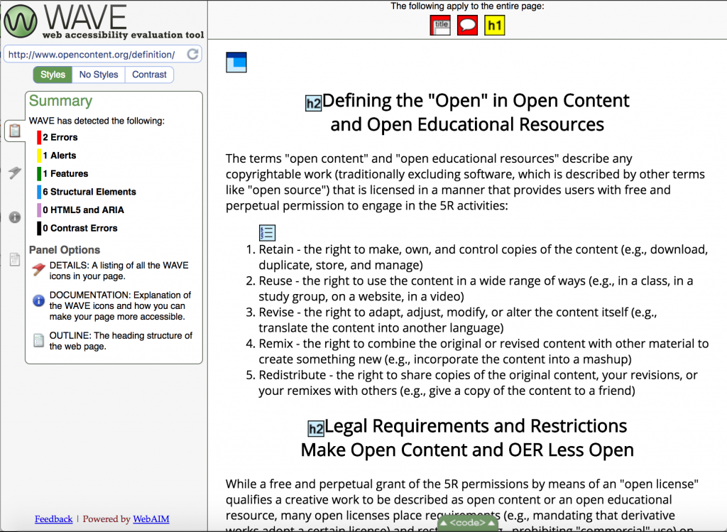
A great deal of OER content is displayed on websites, where we can use accessibility-checking tools to identify areas that can make it difficult for assistive technology tools to work properly. The WAVE tool does just that: identifies errors and possible issues with the accessibility of webpages.
For example, we can see the WAVE tool’s accessibility check on opencontent.org/definition. As far as content structure and formatting is concerned, the page looks great. The WAVE tool caught a couple small errors (a missing page title, missing language declaration) and had a couple warnings for parts of the page that may be troublesome from an accessibility perspective.

Knowledge Check
[h5p id=”15″]

