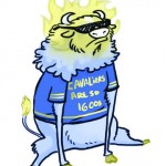
The college has taken upon itself to spend a small fortune paying a marketing company to redesign our logo, colors and mascot. This is an attempt to attract more prospective students, as enrollment has declined. The numbers for spring enrollment headcount on the first day of classes were down 5.9%, according to Dennis Day, vice president of student success and engagement.
Naturally this is a problem, since any college’s goal is to grow and expand, but how significant are a school’s colors and mascot compared to the actual experience of attendance?
This college is one of the best community colleges in the nation; no mascot, logo, or color scheme could prove that. We students are truly lucky to have some of the greatest assets a community college could provide.
Our professors alone make this college the wonderful school that it is – where is their publicity? Some of the professors have been here for over 30 years. Many have won awards, but it is not often enough that we see those stories on the front page of the college’s website. If prospective students knew more about the many accomplished faculty members, they’d be much more inclined to come here.
Our buildings themselves are quite a boon to the college. With the exception of a few buildings, you can get anywhere on campus indoors, meaning we don’t have to trudge through ice and snow in the winter, nor face the sweltering heat of Kansas City summers.
Our student body is hugely diverse. We have students of all different ethnic backgrounds, nationalities, and ages. No one is alone; if you wish to seek out friends, this college is one of the easiest places to do it.
We have a multitude of clubs and organizations, and a huge variety of programs to offer. In addition, students who attend the college before they transfer to a 4-year school statistically attain significantly higher grades than those who go straight to a university. Our success rate is comparatively excellent.
So our colors were brown and gold, then became maroon and gold. Our mascot is the Cavalier. Our logo is a sunflower with one petal left unfilled, representing the knowledge we have yet to obtain. Not many students know that, or what a cavalier is, because most of them just don’t care.
If we do become the Bison, and our logo does become a strange hybrid of the NBC peacock and the Johnson County Park & Recreation District (see http://jcprd.com/), it’s not going to matter. People who dislike it may get angry and the athletes will lose their identities as the Cavs, but the majority won’t even take notice.
We have so much more to offer here. Overall, the rebranding efforts are not a good move on the college’s part. We can do better than that.











[…] InFocus: Price of rebranding InFocus: Picking new team colors Related editorials: Staff Editorial: Rebranding wrong way to boost college reputation Column: Proposed new mascot, logo, colors have little to do with rebranding goal Compiled by […]