 This billboard faces the east-bound lane of I-70 just outside of Topeka, KS. My wife and I used to look forward to the last image on this board – it said, “Superpower your baby” and had a badly photoshopped greased/ cowlicked baby head on a superman body. The text sent a positive message re: breastfeeding and reading to your baby – both activities I support. The graphics just cracked us up. But the first few times we saw this board no one spoke.
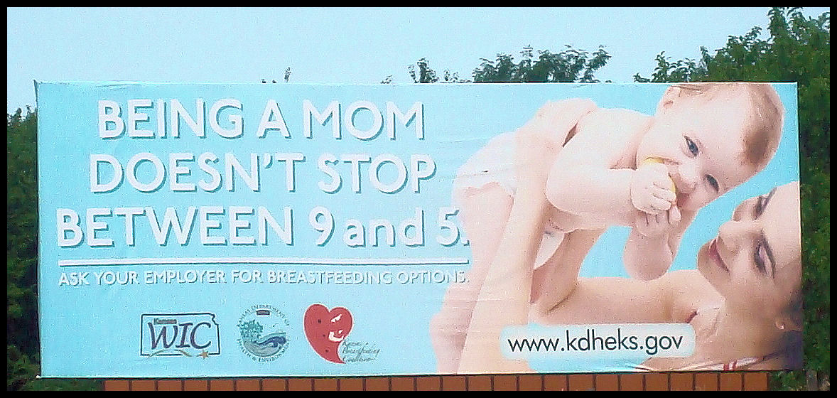
Note this picture has been enlarged, enhanced and sharpened. Traveling at 70 mph, the fine print disappears. Try standing back from your screen to get the effect. I read a harsh message for working mothers.
I try to live by a philosophy of , “Don’t attribute to malice what can otherwise be explained by incompetence,” and I want to trust the KS Department of Health (who sponsored the message) has it’s heart in the right place, but the look at the picture. Why a baby blue background? To blend with the sky and make it invisible (not effective from a marketing perspective), or to call to mind male babies? Why? And white lettering on a pale blue background?
“Being a mother doesn’t stop from 9-5” has to sting any mother. Isn’t working outside the home for a new mother an incredibly touchy subject – that should be approached carefully with sensitivity and tact? Not until stopping by the side of the road as close as I could get to take this picture did I even see the fine print about, “ask your employer for breastfeeding options.” THAT should be the privileged text – that should pop – but it’s nearly invisible. And why would someone look twice if the initial image slapped them with guilt trip?
I’ve only discussed this with one other person, but feedback would be appreciated – is this an epic fail, something worse, merely lame, or am I reading too much into this? I grew up in an art studio and used to have these sort of discussions. Is it effective for it’s intended audience? I’d also appreciate anyone analyzing the photo/graphic.
I would contribute it to incompetence. I would hope an ad agency would have come up with a better layout but for all we know someone with no knowledge of marketing had the final say. I agree that the larger text should "Ask for breast feeding," while the smaller text should just be a tagline. Overall it was done poorly. If we were to base it off of malice would we find a reason that one of the sponsoring groups would have that type of agenda?
The intentions behind a message sometimes don't matter. One might argue the agenda you mention is subconscious – or one might argue that words mean what they mean and the intentions aren't relevant. Just as "I was joking" doesn't work as a defense for prejudiced or harassing language – ignorance is not an excuse for the law. If the majority of people who receive a message gauge it to be sexist (for example) – then it is. Of course if a skilled or persuasive orator/ rhetorician sways pubic opinion…With ethical questions I trust gut reactions and knowing my own equivocal and reflective nature (ie the voices in my head sometimes disagree) I value other people's opinions. Many thanks for your post Royce.