


College will incur multiple costs for new logo, colors
By Jessica Mitchell
The college has decided to undergo rounds of ornamental changes, implementing a strict budget of $120,500.
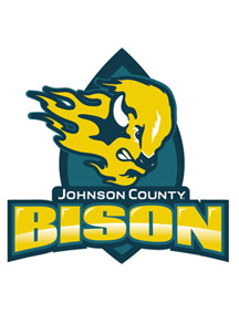
On Jan. 27, 2011, a decision was made by the Board of Trustees to hire Bernstein-Rein, a local advertising agency, to rebrand the college’s 29-year-old mascot, color scheme and logo. The mascot change from Cavalier to Bison and color scheme/logo change would cost the college a minimum of $120,000. The price, however, does not include all of the merchandise and retail replacement that will need to take place once the Cavalier and sunflower are obsolete.
“We will have a clearance sale,” said Trustee Stephanie Sharp. “There’s a markup on that kind of stuff to make a profit on, but [the college] is not going to sell it for less than their cost – so they will recoup…I doubt there will be any loss.”
The choice to undergo cosmetic changes is a way for the college to stay up-to-date and relevant to its current and prospective students. The money spent will then hopefully be reimbursed by a rise in enrollment and an overall understanding of the college’s brand and name.
“If we are using information from 40 years ago to discuss a 21st-century audience, we are really off,” said Julie Haas, associate vice president, marketing communications. “It’s more than just a color, it’s more than just a logo – it’s about knowing your audience.”
When deciding to take on Bernstein-Rein for the rebranding mission, the college implemented a $120,500 maximum spending bar into the yearly budget. The reserved chunk of money has been set aside for this cosmetic endeavor for over a year but the concerns about timing and priorities remained an issue.
“It might seem ill-timed,” Don Weiss, Board member, said. “But on the other hand, the Board made the decision to proceed with this at the time that the recession was really at the bottom. Which meant all this work that needed to be done on this particular project would be the cheapest.”
The money being spent on the college’s brand updates, even though part of the yearly budget, walked side by side with staff layoffs and decreased enrollment.
“What we are doing is nothing different than what every other major company and major organization does on a regular basis,” said Weiss, “and at the time that this was approved, enrollment was still increasing at a pace which was faster than what we can sustain given the amount of classroom space we currently have.”
The established budget for the rebranding mission (not including retail replacement) may seem extensive in the eyes of some; however, it’s a deal in the eyes of the Board.
“Bernstein-Rein is arguable one of the best in the country and we are lucky that they were willing to take us on for such a bargain,” Sharp said. “As far as those of us that are on the board, the second that we saw the quote, we were sold…none of us expressed concerns about it.”
The $120,000 set aside will be covering the cost of design work from creative agencies, like Bernstein-Rein, focus groups and some changes to monument signs and signs on buildings. The costs for full retail replacement are unknown.
“To be honest, $100,000 on a branding study is pennies on the dollar,” Sharp said “I would say a million dollars isn’t at all out of the question, especially for an organization as big as ours.”
For more information on the college’s rebranding please contact any of your appointed Board of Trustees members.
Contact Jessica Mitchell, features editor, [email protected].
[…] New logo. New mascot. For more information about rebranding, please see these related articles: InFocus: Price of rebranding InFocus: Picking new team colors Related editorials: Staff Editorial: Rebranding wrong way to […]
ARE YOU FOR REAL? The Bison symbol is ok, but the powers that be should have put the graphic design students to work on this for better results! They would have taken pride in creating something that we all could like with and at a time when the college is so worried about spending money? How much will all this cost us all? What about syncing everything up – (colors for uniforms and logos for all teams and changing everything – did they even think about this?) This is a huge waste of money!!!
The graphic design program is suppose to be an award winning program – so why didn’t they save the money and use that avenue? This Bison is hideous looking (looks like a version of TEEN WOLF on fire) and the colors are all wrong! I do not understand how educated people can make such bad choices and then use “we don’t have the money to hire people or we are cutting back… blah blah blah – but then waste money in this way! How very frustrating for the community!
Is this for real? Why did the campus spend the money when there is a graphic design program on campus. If it was given to this department, I think there would be a lot better design for FREE than what is shown here. The Bison? Really? More pride would have gone into the project than this. That 120K could have gone to better causes on campus.